HomeGoods Website
Editorial inspiration and customer finds turned into great decor and beautiful homes.
Brief
HomeGoods had a web presence and a devoted clientele. Their business model doesn't allow online sales, so they have always focussed on inspiring their customers to create beautiful and useful homes with their offerings. They were now looking for an online presence that would do the same for their online audience, one that would showcase the great influencers that adored and promoted the brand and stores through their blogs and social media.
I was brought in as UX and strategy lead to design a site that solved a specific goal: showcase great home decor content and inspire followers into creating snazzier homes with HomeGoods, all in a simple and elegant way.
Approach
HomeGoods' business model—discount overstock with store-by-store inventory—made catalogs impractical, so their focus has been on suggesting ideas on how to make beautiful home interiors, so their clients can learn how to bake the best with the home decor they find in their local stores.
To do this online, they wanted to give a prominent space to influencers and bloggers that were already spreading these ideas through their love of the HomeGoods brand and offering.
Understanding the customer needs and their context
We did an extensive ethnographical research, interviewing 12 homes in Chicago, Santa Cruz, and Atlanta. With the findings and information we gathered, we created several personas—fictitious profiles that would reflect commonalities brought out by the interviews—to help the team keep focused on the user needs and context.
Through this research we learned that the customers of HomeGood tended to be moms with little extra time in their hands. I also observed that many of them liked the idea of a magazine, a simple browsing experience of lazily turning page after page with a single free hand until something caught their eye, which they would earmark for later.


Visitors never ran out of inspiration
With the idea of trying to recreate as much as possible this lazy browsing experience, I proposed the idea that articles would never end: as a visitor reached the end of one post, a new one would load and surface automatically, like a tissue from a Kleenex box, making the browsing experience both infinite and continuously engaging. (This was before all social media had adopted this infinite scroll mechanics).


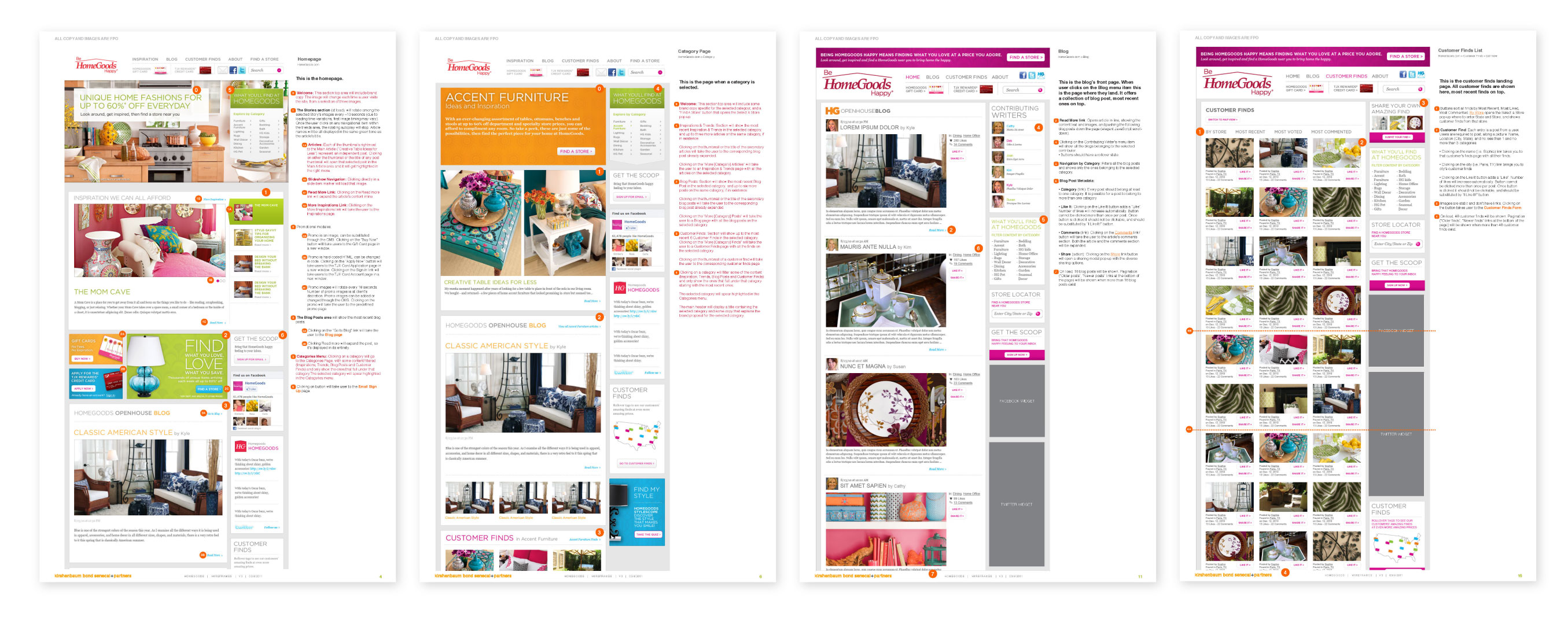
A design-driven client aligned from day one
In a project where the site couldn't follow e-commerce conventions, keeping stakeholders aligned on what the experience would feel like was as important as the design itself. All annotations and presentations to the client were made directly on designs rather than on wireframes or separate documents.
This meant every stakeholder conversation was anchored to the visual direction — reducing the gap between what was discussed and what was built.


A mid-budget client got a high-budget treatment
HomeGoods' owners were deeply invested in the outcome, closely involved at every stage, with a clear sense of their brand ethos and a high bar for how faithfully the design needed to reflect it. Rather than managing that through wireframes and staged sign-offs, I proposed presenting directly on hi-fidelity designs from the start.
The rigorous and thorough process—ethnographic research, personas, strategy, design workshops, through to QA and launch—convinced the client that the investment was warranted. The result was a product they were genuinely proud of.
Results
A fully launched website for HomeGoods, from ethnographic research through to QA and live deployment. An editorial inspiration destination that drove store visits in place of online sales, built for a retailer whose business model precluded e-commerce entirely.
1 launched site · 4 personas · ethnographic research to QA · store-visit conversion as primary goal