


Thoughts
Poor-Design Coefficient
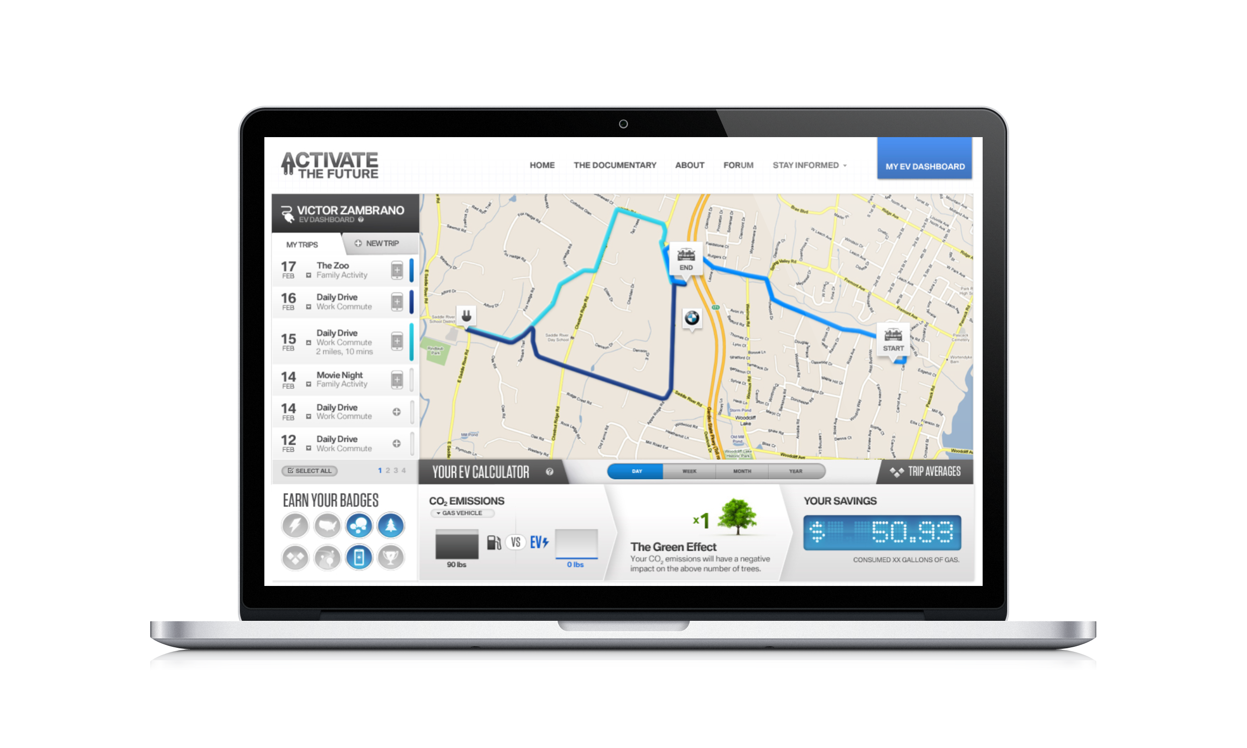
Victor Zambrano
Sometimes it’s very difficult to know if a digital product/service is well designed: one has to both have the context of the intended user, and be able to use it as intended by the task to be fulfilled.
However, it is quite easy to know when some digital products/services are somehow poorly designed:
Just take 1 point for every single error message, empty search screen, and empty filter process and double that point for each step taken into completing each of those processes.
And there’s an example of a "poor-design coefficient". Why?
Designing digital products/services is like creating walkways between where the user is, and where the user wants to be.
In building walkways, the ones with guardrails that offer more security are usually the best ones, and surely the less dangerous to users.
It’s the same in digital design: your design can, and should, protect the user so they arrive faster and with less issues to their destination. And every time they don’t, it is because your design didn’t protect them from falling out the walkways.
Every time users use open-ended search and get no results after entering a full string is a missed opportunity to give them feedback after each stroke so they don’t get to an empty screen not knowing they’re narrowing down too much their search and results may not be useful, and thus waste all that time.
Every time they filter down to an empty screen means a lost opportunity to let them know how many items each filter option hold, so users can make better filtering selections to get closer to an optimal result, and thus waste all that time.
Every time they hit an error screen was an opportunity for the interface to better guide them into making decisions that would not end in errors, and thus waste all that time. (Note: Errors are a reflection of the limitations of a platform, not of the user’s mental model, which usually is correct anyway).
Errors, empty searches and empty filtered results are wasting your user’s precious time. Your product’s mission should be to shield them of wasting their time, so do the work needed so that they, users, end up making better decisions.
That is, after all, all that design aims for: help users make better decisions.
_PS: This is an obvious oversimplification of a very complex and nuanced process; clicks that take users in a direction they did not want to go, screens where users can’t make decisions, or interfaces where users get confused, are also signs of poor design. I'm focussing here on simpler, high-stakes, low-effort scenarios to make an easier, more digestible point._ 😉
~ • ~