


Intel.com Redesign
Improve the experience of visitors and content creators by adding simplicity and storytelling to Intel.com
Intel.com had grown beyond anyone's ability to manage it consistently. Too many templates, too many content modules, no coherent logic holding them together. The result was a site that was hard for content teams to work with and hard for visitors to navigate.
I was brought in to bring it back under control: rationalise the template system, make the site fully responsive, and improve the experience for both the people creating content and the people consuming it.
Approach
The starting point was analysis: understanding everything the site contained before removing anything. From that foundation, the direction was to reduce the template and module count to the smallest set that could still cover every real use case, then organise those modules into storytelling templates that gave content creators a meaningful starting point rather than a blank canvas.
Every design decision was kept honest by real visitor research
Before touching a single template, I ran user research with Intel.com visitors, built persona profiles from those findings, and mapped reference customer journeys for each. These kept the conversation grounded throughout. Whenever a content or structural decision came up, there was a real visitor profile to check it against rather than an internal assumption.

Personas
Personas built from visitor research — used to ground template decisions in real user interests rather than internal content structure.

Customer journeys
Customer journeys for each persona, showing information interests and relevant site sections.
Visitors and content teams got a site built on 9 modules instead of 47
Working through every existing template and content module, I identified the patterns that actually recurred across the site and the ones that didn't need to exist independently. The full set condensed into 9 fully responsive, stackable modules covering everything the original sprawl did, with a logic that content teams could actually learn and apply.

Content modules
The 9 content modules — designed to be stackable, responsive, and able to replace all 47 existing templates.

Storytelling framework
Storytelling paths proposed based on persona needs and customer journeys.
Content creators got 12 storytelling templates that told them where to start
Nine modules on their own were still a blank canvas. The next step was giving content teams a set of pre-composed starting points that we called "storytelling templates": combinations of modules arranged into sequences that matched the visitor journeys defined in the persona work. The result was 12 content templates, each structured around a specific storytelling purpose: how to introduce a product, how to present a technical topic, how to lead with a campaign message.
Content creators no longer faced an open system—they had meaningful starting points that reflected how Intel's visitors actually read and moved through the site.

Template combinations
The 12 content templates, each built by combining modules into sequences that matched the persona journeys.
The client experienced every decision in a working prototype, not a static presentation
Rather than presenting designs as mockups for the client to imagine in use, everything was defined, designed, and shown through an interactive prototype.
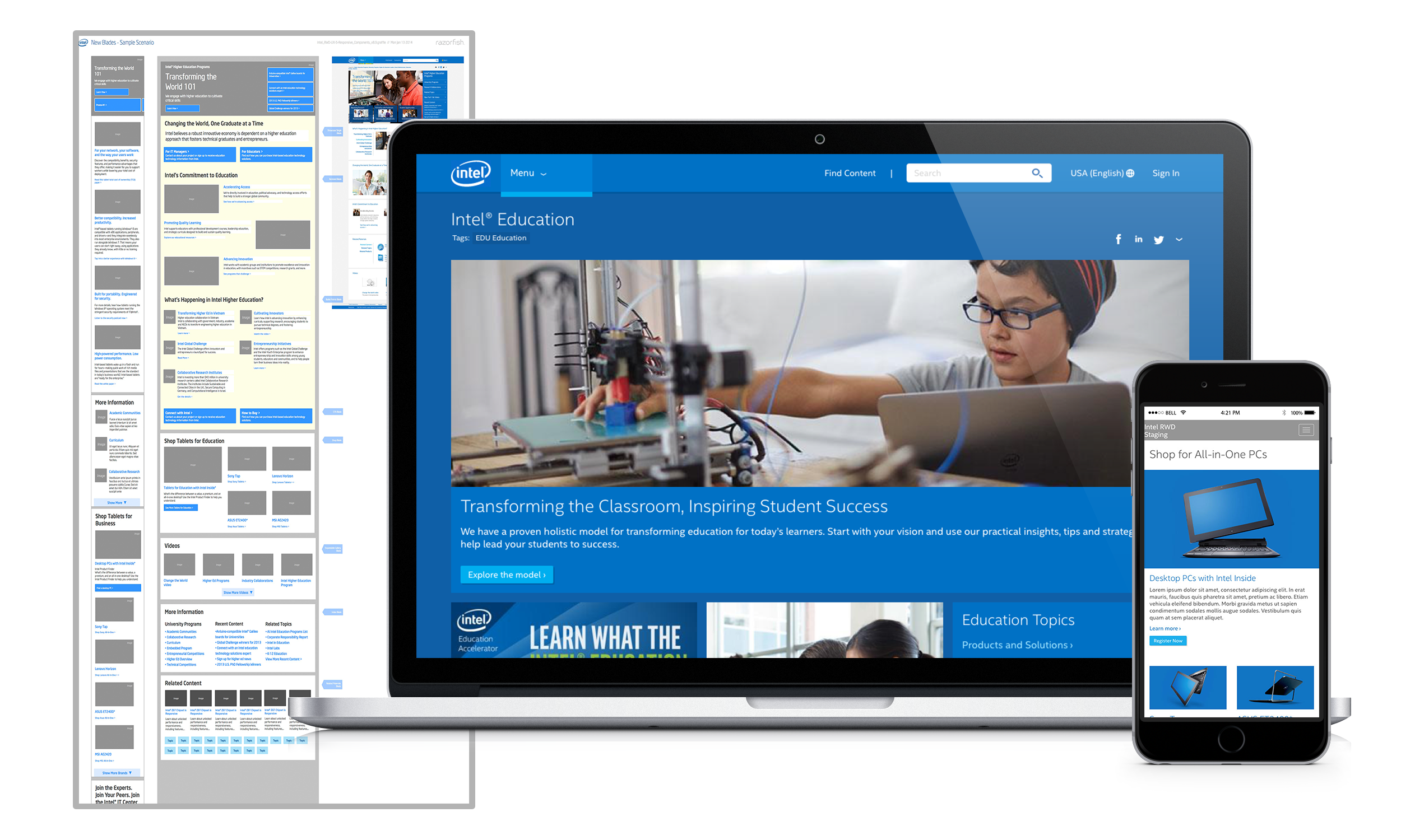
The client could navigate it, test it across their 27-device lab—iPhones, touchscreen ultrabooks, ultra-wide monitors—and give feedback on how the system actually behaved rather than how it looked on paper.

The interactive prototype
Tested on 27 devices in Intel's own lab before client reviews.

Final designs
Results
Full responsive redesign of Intel.com delivered: 47 page templates reduced to 9 content modules, combined into 12 content templates. Designs validated on 27 devices across Intel's internal test lab, from iPhones to touchscreen ultrabooks to ultra-wide monitors.
47 templates → 9 modules · 12 content templates · tested on 27 devices