CloudMondo Wi-Fi Apps & Platform
Powerful and accessible network management tools for all budgets
CloudMondo had already tried to bring their cloud-managed Wi-Fi platform to market once. They'd hired a design agency to build the apps. The result was a product that looked designed — and didn't work as one.
The visual aesthetic was high-contrast and dramatic, but the product had fundamental problems underneath. The information architecture didn't reflect how users actually thought about their networks. Key flows—particularly router onboarding, the most critical moment in the entire consumer experience—were unclear and error-prone. The multi-persona nature of the platform—consumers, ISP technicians, operations managers, executives—had never been properly addressed: everyone was being pushed through the same interface regardless of what they needed to do.
CloudMondo brought me in to fix it.
Approach
Before touching a wireframe, I ran a cross-functional workshop with stakeholders and engineers to map user flow hypotheses and build proper persona profiles from scratch. The goal wasn't to gather feature requests—it was to understand what had gone wrong and why, and to build a real picture of what the platform needed to be.
We identified six distinct user types:
- Consumer with device — setup, monitoring, guest access, troubleshooting
- SMB owner/employee — network visibility, access control, accountability
- VAR/ISP technician — field provisioning, bulk device configuration
- VAR/ISP customer support — issue triage, device status, escalation paths
- VAR/ISP CFO / VP Engineering — fleet-level reporting, predictive maintenance, SLA dashboards
- Consumer without a device — discovering and connecting to free CloudMondo Wi-Fi
Designing one app that served all of them was the wrong approach. Designing a platform—with distinct, purpose-built apps for each user type—was the right one.


Map the system before designing anything
I then sat down in detail with the engineering team to understand exactly how the micro-services communicated—router, cloud backend, and configuring app—and built a full interaction model from that. The previous design had glossed over system states and edge cases. Understanding what the system could and couldn't do at any moment was essential for designing flows that were both honest and robust, particularly through the complex router onboarding sequence.
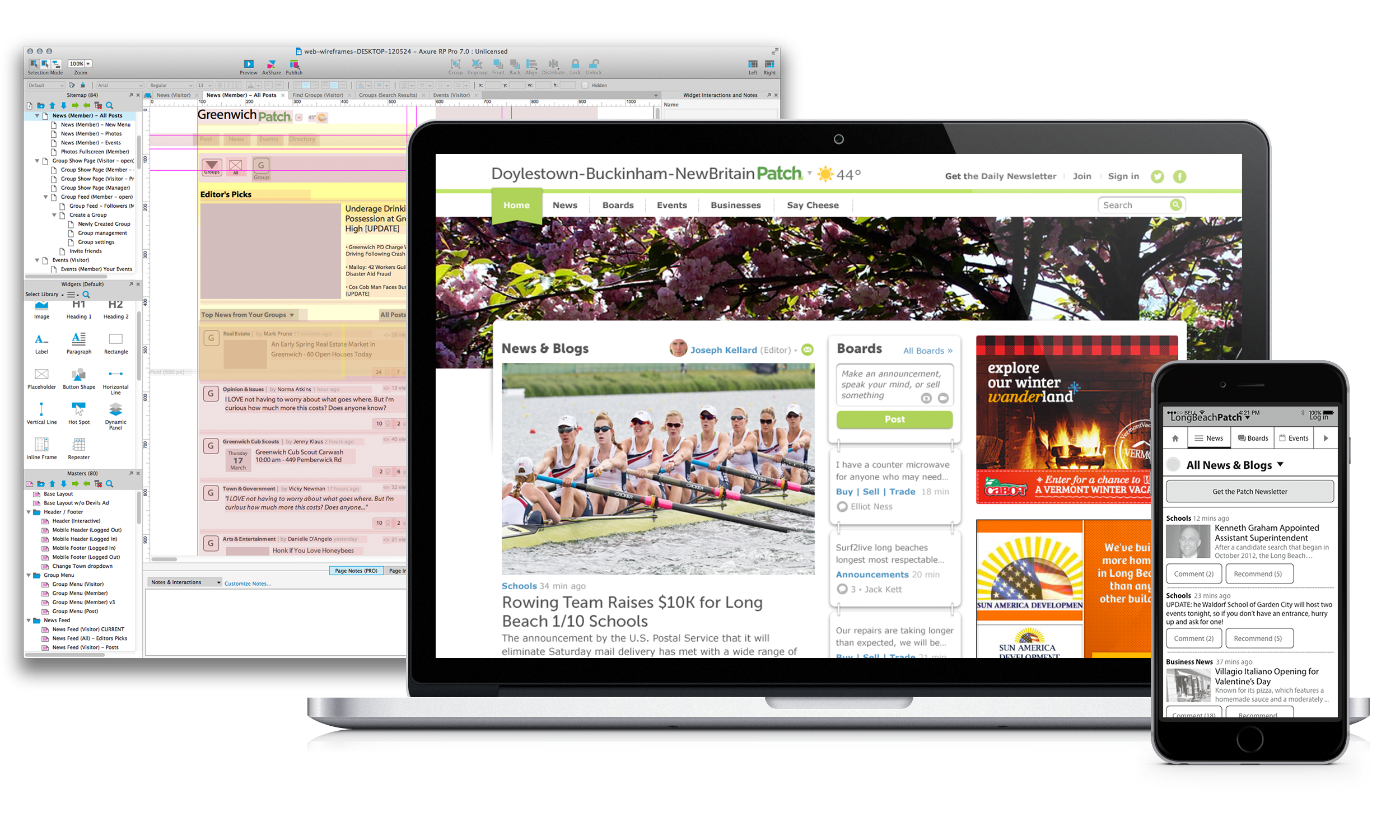
I then mapped a complete flow for every user goal. Initial sketches happened on the whiteboard with the team — fast, disposable, and easy to challenge.
Every flow was then documented in the company wiki—giving the engineering team immediate, always-current access to screens and logic without waiting on design handoff.
Within a week, the core user flows were drafted, reviewed, and ready for wire-framing—with wireframes embedded directly into wiki pages so anyone on the team could review and flag issues in context.

Full interaction model
After conversations with all engineers, I created a full diagram of all communications between the wifi router, the backend and the configuring app.

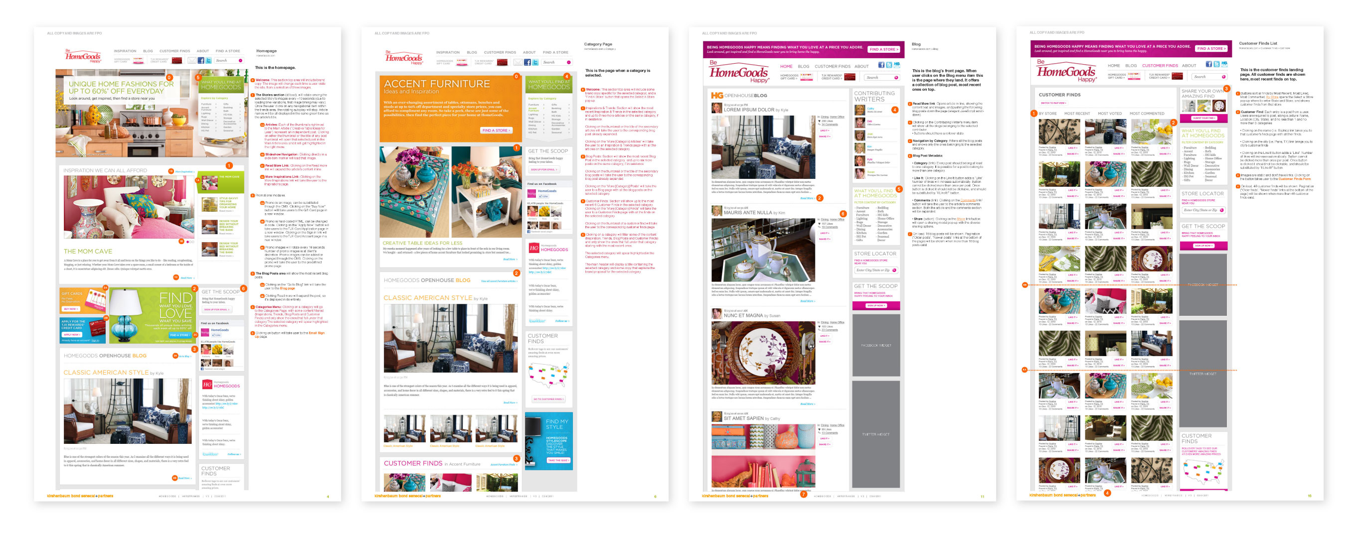
Quick User Flows
User flows with wireframes documented on the company wiki, allowing the team to quickly review and update them.
Test the prototype with stakeholders and users
I kept an interactive prototype always updated and posted online so everyone would have access to the most current designs at any time.
I also used the prototype to do some internal testing. I asked some of the leadership and developers to share the prototype with their families to gather their feedback.
The testing helped us realise some very interesting findings: users called "wifi" anything they couldn't see — the router, the signal, the icon on their phone. Nobody knew what "SSID" or "WiFi Device" meant.
And contrary to what the CEO wanted—the mythical 3-clicks flow—users didn't mind more steps, as long as each had a clear reason and enough context for them to move forward with confidence.
All these findings informed and improved the language, the structure, and the entire onboarding logic.


Design to platform standards, not a shared template
Each app was built to the standards of its platform—Material Design for Android, Apple's Human Interaction Guidelines for iOS—with separate interaction models rather than a single design adapted for both.
This added design effort but produced apps that behaved consistently with what users expected from each platform.
For a consumer product and for operations tools used daily by Internet Service Provider teams, that consistency directly affected whether users trusted the product enough to rely on it.

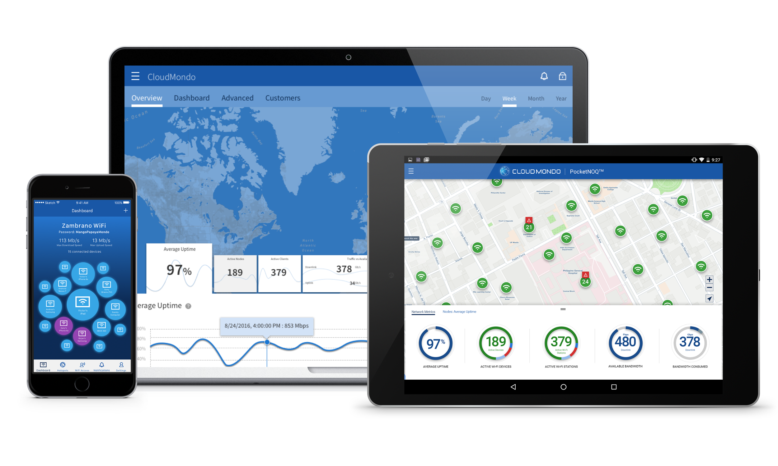
PocketWiFi consumer app
Top row are the wireframes, bittom row are the designs.

PocketNOQ tablet app
Top row are the wireframes, bittom row are the designs.

WebNOQ web dashboard
Top row are the wireframes, bittom row are the designs.
Results
Six apps delivered within a six-month deadline, across two development teams in the US and Slovenia, on two-week sprint cycles with testing each release, to be then tested in a 3 month pilot programme in Manila, Philippines, to a successful public worldwide launch.
Within 6 months of launch:
32 paying customers • 15,000+ end-users • 7 apps deployed across 12 countries