
Fluidtime Site
Ideas, design and development for a new simpler, easier to update and more informative site for Fluidtime.com
2006
Fluidtime.com needed a redesign. The existing site was difficult to update, lacked clear information hierarchy, and didn't effectively communicate the company's growing range of real-time transit and event services.
I designed and developed a new version of Fluidtime.com — simpler, easier to update, and structured to clearly present the company's products, features, and business proposition.
A cleaner site that the team could maintain
The redesign used Fluidtime's green brand colour as the primary accent against a clean white layout, with clear section navigation and a content structure that separated the consumer-facing product information (access Fluidtime, features, support) from the business-facing pages (about, company).
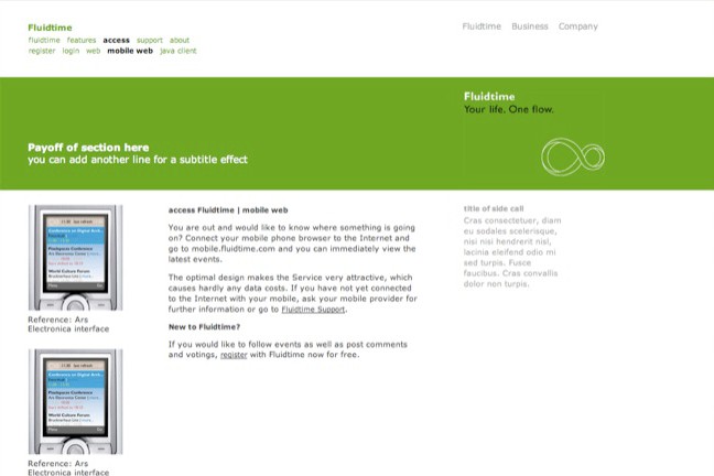
The new site was built to be easily updatable — new products, features, and news items could be added without redesigning pages. The layout accommodated mobile app screenshots, service descriptions, and reference links within a consistent template system.


Results
A complete redesign of Fluidtime.com — simpler information architecture, clean visual design, and an updatable structure for the company's growing product range.
5 screens · redesigned IA · easy-to-update · designed & developed for Fluidtime